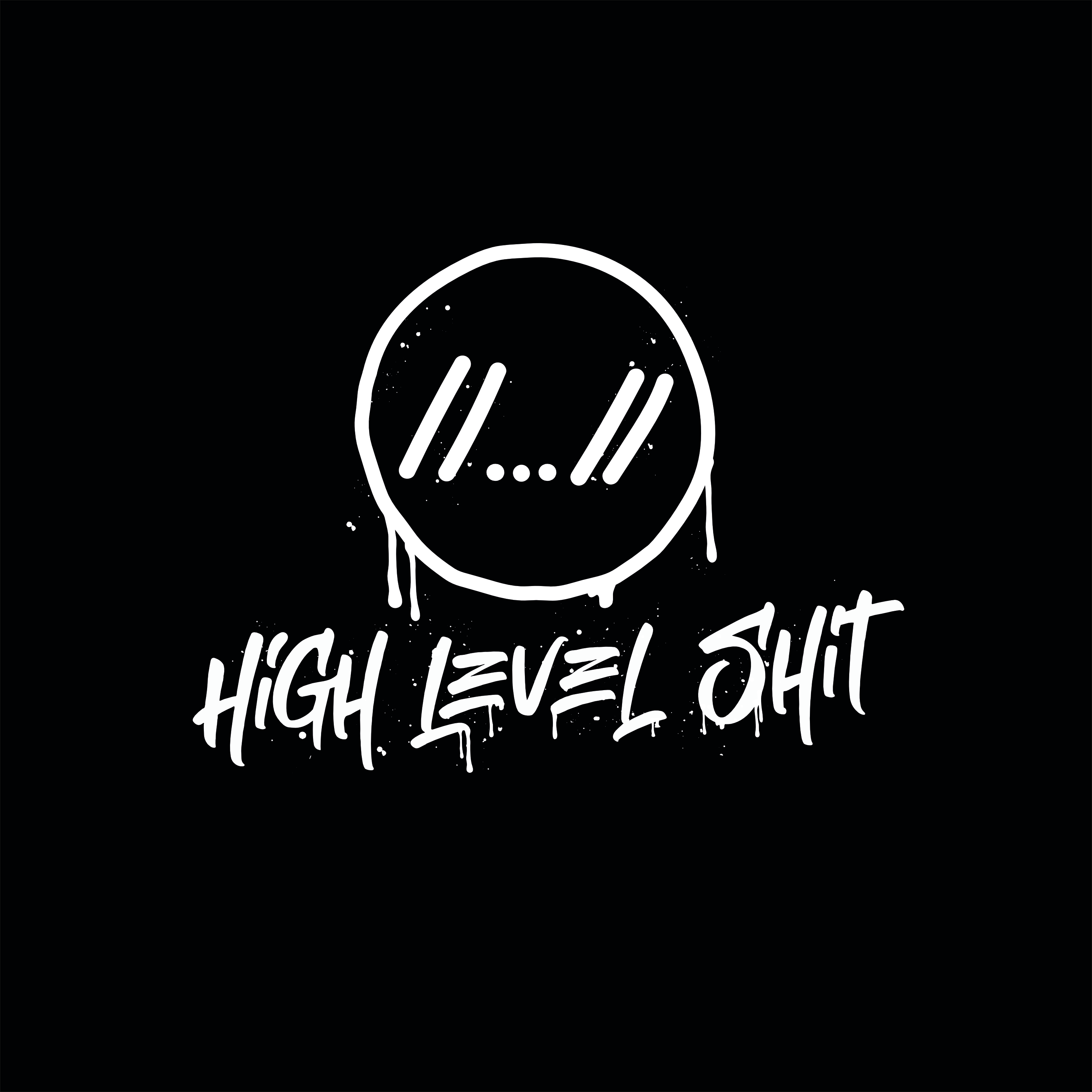
A friend of mine asked me for help creating a logo. The logo should represent his study group named 'high level shit'. They were in their last year of their bachelors and wanted to have a hoodie with a logo. In regards to style he showed me some streetwear logo designs. Most of them with a graffiti aesthetic.
I started of by sketching wordmarks in photoshop. My focus was on positioning of the words aswell as typography. At this point I propably should have tried to get feedback from my 'client'. But I didn't and started realizing the first one I liked in Illustrator. After I created this first design I showed it to my friend. He didn't really like it. So I went back to the drawing board, created some new designs with the new feedback, we agreed on one design and i realized it. I think the logo might have too many details to get a good print quality on a hoody. I also think my initial design had quite some potential had it been further developed and might have been more eyecatching just because it had colors. I do like the figurative brand though. I think it nicely captures a programy vibe.
